
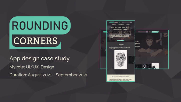
Project Overview
|
The Challenge
Having only designed applications for one screen size in the past, my studies in UX design called for a product that could adapt to different platforms. While brainstorming ideas that would work well for this fictional app, I aimed to create a product that would help rural artists who wanted to work on large-scale projects. This drew from my experience of going to college in Vermont, having known many classmates who sought opportunities to work on the massive movies and games that captured their imaginations. |
The result
Rounding Corners is an app designed to connect artists with professional mentors. Our goal is to bring eager, energetic students together with industry veterans who can give them the expertise to thrive. |
Research
|
Interviews
My research included reaching out to several artists from the northern Vermont area. These are individuals that have frequently expressed a desire to work on large-scale projects in the industry, but don’t have the means to live in major hubs such as Seattle, Austin, or Los Angeles. In my research, I was frequently told that being able to connect with mentors with industry experience, on a frequent and reliable basis, was key. Interviewees expressed the three notes at right as the biggest pain points. |
Findings
|
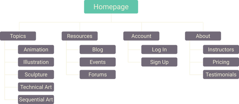
Foundations & Ideation
Sitemap
My initial sitemap was focused on providing users with social tools and nuanced categories to address different mediums in the visual arts field.
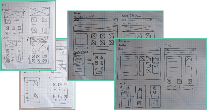
Paper Wireframes
Initial layouts revolved around how to present multiple visual arts mediums, all with equal importance.
From the start, I wanted to design a layout that would respond well to different heights and widths across a
variety of devices.
From the start, I wanted to design a layout that would respond well to different heights and widths across a
variety of devices.
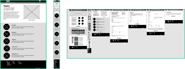
Digital Wireframes
As the site was designed with visual art in mind, a strong focus on imagery was in the design process from
the start. My strategy involved getting users excited to see their favorite mediums represented, and perhaps
find some new ones. As users would be communicating with mentors often, it was critical to the design process
that there would be the freedom to seamlessly switch between PC, mobile, and more. Additionally, the flow and
general spirit of the site’s design needed to remain intact. Low-fidelity prototype available in description.
Usability Study
Parameters
Study type: Unmoderated usability study
Participants: 5 (3 male, 2 female)
Location: United States, remote
Length: 20-30 minutes
Study type: Unmoderated usability study
Participants: 5 (3 male, 2 female)
Location: United States, remote
Length: 20-30 minutes
Findings
- Finality
Even when told that a design is a prototype, users will fixate on visual shortcomings such as color, distracting them from the design itself. - Sharp Focus
Ideally, all objects in a prototype are interactive, even if this results in a barebones design; users will be frustrated otherwise. - Fewer clicks/presses
Users reacted positively to a sticky header, in which all pages they would need are always on the screen.
Wrap-up
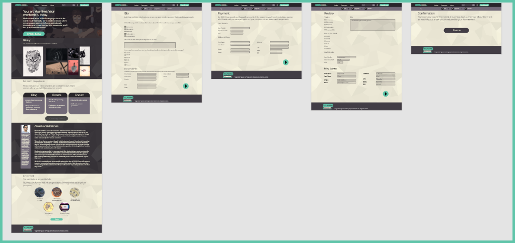
High-fidelity prototype
|
In the finalized design, feedback was used from the usability study to improve the layout. Additionally, user accessibility was considered. For example, high-contrast is used for those who may have difficulty seeing, speech-to-text is available in the search bar, and many elements are accessible via the home page. This allows users to either click buttons in the navigation bar or scroll, depending on which is easier for them. The high-fidelity prototype is available in the description.
|
|
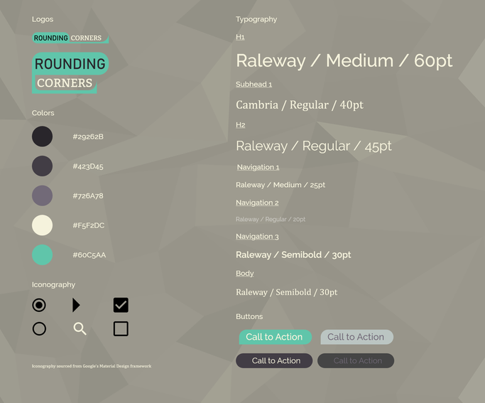
Sticker Sheet
Takeaways
While creating initial concepts, I found it easy to get carried away, and try to include everything that I would've wanted from
an app like this. As I continued refining the design, the value is stripping the site down to everything but its core features became
more clear, particularly in the usability test phase. I've continuously found that users react much more positively to a clean, straight-forward design than one using placeholder assets for a site that closely mimics what a real app may include.
Links
Stock images used under Unsplash's free use license. All icons (except for profile icon, designed by myself) found on materialdesignicons.com. Icons are free for use as described by Pictogrammers Free License on Github. All other visual assets and designs created by myself.